Interior Colour Palettes & How to Choose Them

Colour is one of the most important elements when decorating interiors, as it is linked intrinsically to our emotions and memories. The right colour combination in a room can evoke specific emotions – whether it be calming, energising or inspiring – and create the perfect atmosphere. We’ve already shown in our previous blog post how colour can be used to transform the shape of a room, so take that into consideration whilst we look at how to go about choosing the right palette for your project and which colour trends you’ll find in 2020.
How to Choose Your Palette

Understand the psychology of colour
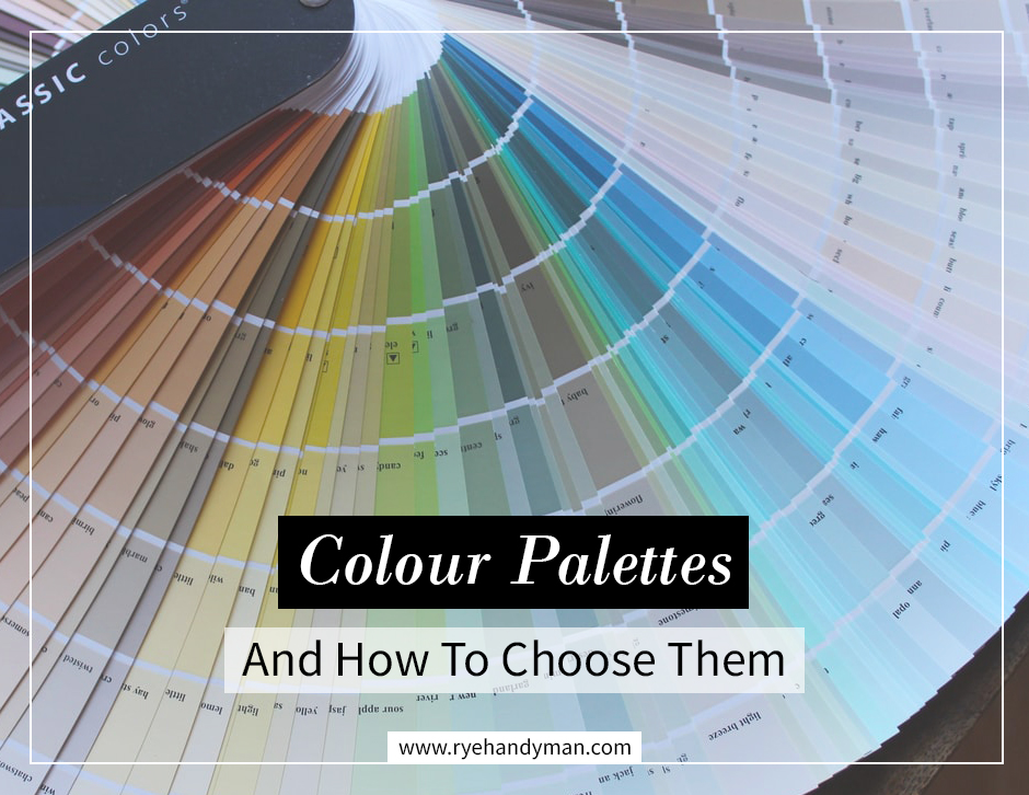
This is not as scary as it seems! We all have an innate understanding of colour and how certain shades make us feel and think – blues make you think of cold, reds make you think of heat, yellow can evoke happiness, and green may remind us of nature. But there is such a vast range of colours available to buy and it can seem like an insurmountable task to narrow it down to a few you would like to work with. Take the time to look at colour wheels and understand harmonies and complementary shades, and you’ll have a good grounding towards your decision.
Create a mood
Once you feel you understand how colours work, choose your colour scheme based on the mood or ‘personality’ of the room. Your bathroom could be a relaxing environment, reflected in soothing blues and greens reminiscent of the sea, or a bright, invigorating space with whites accented by splashes of bright yellow or orange. If you want your living room to feel warm and inviting, choose cheerful and warm colours instead of dark and moody. Kitchens are always a hub of activity, so why not go for a neutral palette to balance it out? If your home is a specific period property and you want to keep the themes of that period, take them into consideration when choosing the colours too.

Add colour to monochrome
The minimalistic black-and-white scheme has been updated to include various hues of grey, but even then that tonal look can be a bit much. Bring another complementary colour in to lift it and provide depth.
Balance patterns
Use bold colours and fussy patterns sparingly. Too many different mixes start competing for attention and it can become a bit of a headache whilst the mind tries to decide which to look at first. Break up patterns or combinations of bright colours with a neutral palette to give the feeling of space and balance. If there’s a particular feature you want to draw attention to, use the pattern there and frame it with neutrals, as it will be the first thing the eye is drawn to.
Link the rooms
Being able to decorate each room in a different style is all part of the fun of interior decoration, but this can sometimes lead to the feeling that the rooms are disjointed, especially if there are areas where doors are regularly left open and you can see through into other spaces. Use complementary colours or choose a colour from one room as a feature or accent in another to draw you through.
Tips:
– Some DIY and interiors websites have an app or feature that allows you to take a photo or video of your room and change the colours to give you an idea of how they will look. These are great for helping you choose but don’t rely on them. Light – natural and artificial – have a serious effect on colours and how we view them, so always take some paint cards or samples into the room itself.
– Check the undertones of the shades you’re looking at. You may have settled on a complementary combination of a neutral and a bright colour, but if one has a cool undertone and the other is warm, they may clash.
2020 Colour Trends:
Earthy tones – terracotta, saddle brown, hunter green

Moody darks – peacock blue, off-black, charcoal, wine red

Abstract brights – classic red, bright blue, burnt orange

Jewel tones – emerald green, rich purple, garnet red

Classic neutrals – off white, soft beige, warm avocado, pale grey

Pale pastels – light blush, mint green, faded duck egg

For more inspiration, why not take a look at our Pinterest board, ‘Interior Colour Palettes‘? If you have any favourite colours or combinations, let us know in the comments below!